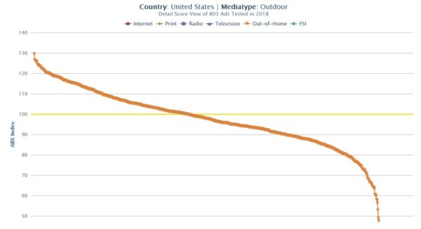
In our systematic review of good and bad ads for 2018 by Media Type, today’s post focuses on Outdoor Advertising. Our syndicated ad effectiveness panel tested 803 OOH ads last year, so we decided to look at six of the Top 5% and three of the bottom.
What Makes Great or Not Great Out-of-Home Advertising?
Earlier this month, we profiled the best print ads of 2018 out of 3100. Looking now at Out-of-Home (also referred to as OOH), let’s view some of the Top 5% – and some of the worst – for 2018. We measured 803 OOH ads of all types and sizes, which are represented in the chart above. The continuous orange line is made up of separate dots, each of which is an outdoor ad. The yellow line shows “Average” ABX Index scores, which measure ad effectiveness with 14 KPIs. You can see there are more ‘bad ads’ than ‘good ads,’ so let’s look at some examples.
Three Top Billboards
1. Wendy’s
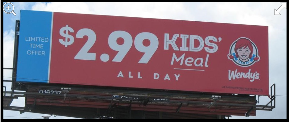
Fast food always dominates billboards and 2018 was no exception. The super simple, easy-to-read board below from Wendy’s ranked #1 out of all 803 OOH ads this year. The high Reputation score of 177 says it all: viewers appreciate Wendy’s meeting them where they live with great prices. At an ABX Index of 129, this board ranks in the Top 5% of all 160,000 ads ABX has tested in all media and 14 countries. Why? You can’t miss the message; it sounds generous, which impacted Reputation, Likability and Relevance. Beneath Action, individual CTA scores included Intent to Purchase at a very high 221 and Intent to Recommend at 207, not to mention other high-scorers across the board. Simple and clear works.

2. McDonald’s
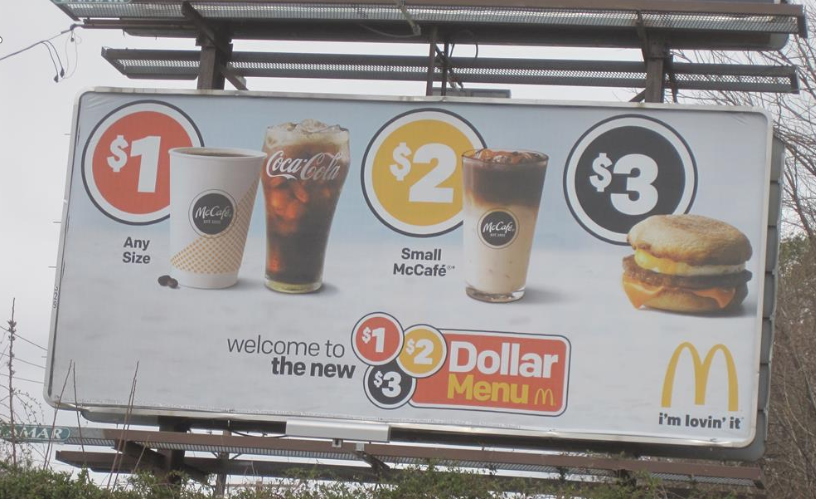
McDonald’s had many OOH ads in the Top 5%, but this poster was our favorite since the $1, $2, $3 menu is easier to understand than the others at a distance. But, the Message score of 127 doesn’t quite meet Wendy’s, nor does Reputation or Calls-to-Action. On a positive note, it outplayed Wendy’s in Action overall, with Intent to Purchase at a gigantic 278, Talk About at 183; Look for at 163, and so on.

3. Popeyes
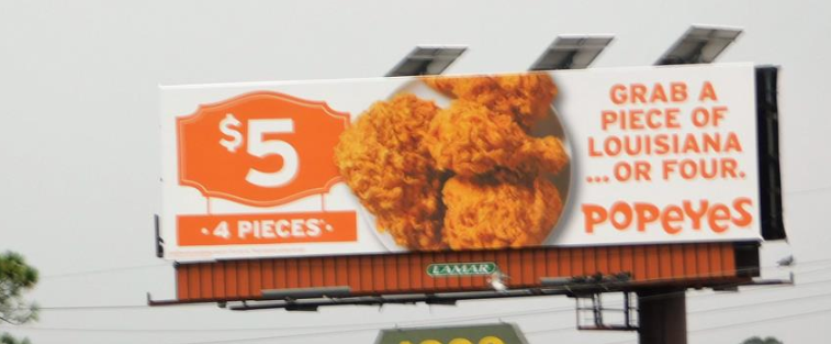
This board stood out for it’s wonderful coloring that speaks volumes about spicy Cajun cuisine in Louisiana. The clear $5 value for 4 pieces also resounded. Popeye’s outperformed Wendy’s and McDonald’s in overall Action results for this color-coded ad. Intent to Purchase hit 239; Contact the company is 166; Look For is 171, and so on. Well done, Popeyes.

Three Top SuperMarket Shelf Toppers
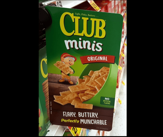
1. Keebler Club Minis
This humble topper has a surprisingly high score. It’s simple, colorful design appealed to the ad panelists who rated it high in both Brand Awareness at 108 and Message at 125. It was Likable, viewers wanted to See it Again, and it was Relevant. For Action CTAs, the biggest was Purchase at 265 and Look for at 182.

2. Häagen-Dazs
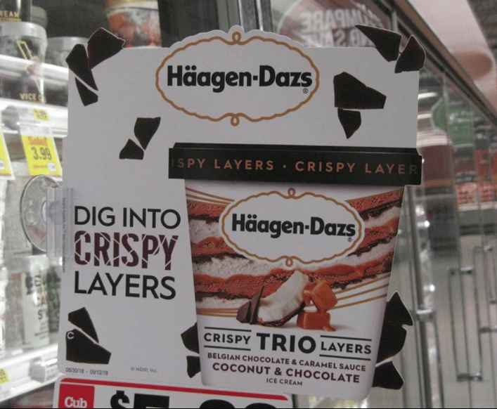
Häagen-Dazs creative department or agency is determined to kill all of us who live on diets! This topper promoting the crispy layers of Belgian Chocolate, Coconut and Caramel, should be banned. The die cut around the bits of chocolate are lethal for those easily tempted. A Message score of 120 and Reputation of 174 tells us panelists were equally impressed. Intent to Purchase is a big 232 among other good CTAs.

3. Dawn
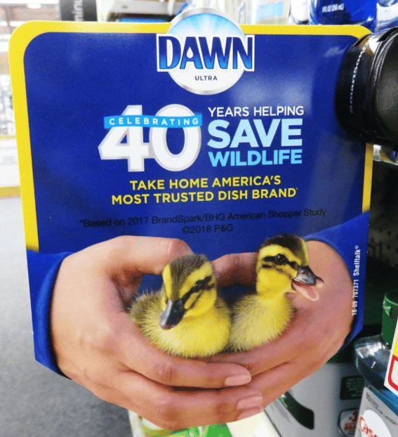
My personal favorite is this fabulous topper from Dawn complete with 3D protruding hands holding baby birds and talking about wildlife. What a beautiful piece of art using contrasting colors (yellow and blue). The eye is drawn to the topper and is rewarded and the PR message drove Reputation at 152 and Likability at 161. Interesting, this “image” topper drew a huge Purchase score of 259!

Three Lowest-Scoring Outdoor Signage
1. Tequila Cazadores
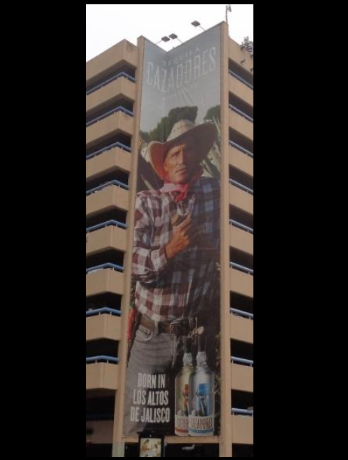
Someone spent a lot of money on this building banner that scored a 47 ABX Index for advertising effectiveness. Given that a score of 100 is “Average,” you get the idea. Every KPI was in the far-negatives since the Brand name at the top of the building could barely be read, the Message wasn’t clear, the ad wasn’t considered Relevant and and panelists scored Dislike at an enormous 263 points. Of interest is the ABX Gender Equality Index™ which shows viewers did not believe the male actor was portrayed in a respectful, role-model sort of way. In checking scores of respondents who are Drinkers Only, the scores changed very little. In the end, Reputation was a mere 15 and intended Action included no positive CTAs.
Here’s the irony: Cazadores is actually doing great work advancing alcohol responsibility and has a great history to tell. The brand’s other OOH boards use the same “Born in” message and male character, and don’t score much better. We hope Cazadores sees this analysis and takes time to rethink how they portray their wonderful story.

2. American Express
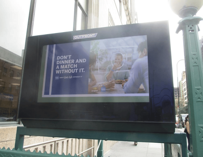
Then we have this digital poster ad that someone forgot to proof. Can you make out what the Brand name is or what the headline means? Or what the product is? This poor ad failed in every KPI and CTA.

3. Betterment
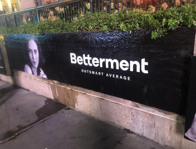
Finally, we had to include this poster stretched across a garden. What is Betterment? At a Brand Awareness score of 69, it’s a safe bet no one knows. What does the Message mean with a score of 49? And what is “better” about stretching a sign across a leaky garden — or did the moisture come from other sources? Even the female actress was scored down for being part of an ad that makes no sense.

In summary, good OOH ads are simple, clean, colorful, creative and understandable at a distance. Bad OOH ads hide brand names, don’t communicate clear messages, aren’t carefully proofed and are placed in sketchy locations with scary moisture running down them. What else? We’d love to hear your thoughts!
If you have questions about this article or how ABX can help your brand, contact us HERE.
